

1. Turn Blank Walls into Brand Experiences
Modern offices are designed to do more than accommodate desks and meeting rooms. They also communicate culture, personality and professionalism. One of the simplest ways to transform an ordinary workplace is through well-planned office wall graphics. Instead of leaving large surfaces blank or filling them with unrelated posters, businesses can use walls to tell their story and create a stronger visual identity.
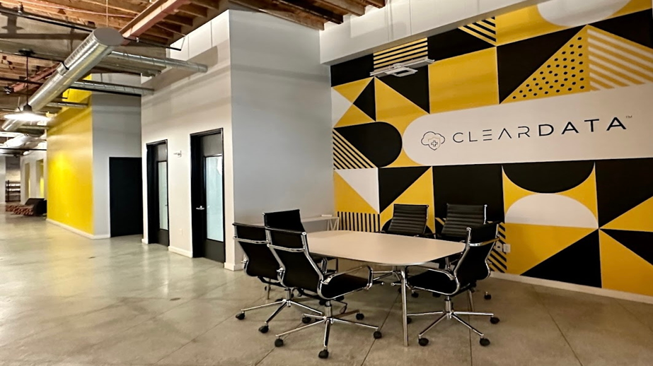
A reception feature wall is often the first opportunity to make an impression. A large logo, dimensional lettering, premium graphic or illuminated element can create a clear focal point. Behind the reception desk, a combination of brand colours, textures and typography can make the space immediately recognisable without overwhelming visitors.
A brand story wall can take this idea further. Important milestones, company achievements, locations, products or memorable moments can be arranged as a visual journey. Photography, icons and short statements usually work better than long paragraphs because visitors can understand the story while moving through the office.
Mission and values graphics are another useful option. Instead of displaying a company statement as a small framed poster, a large wall can give the message more presence. Short phrases, strong typography and simple visual elements can reinforce the culture employees experience every day.
Companies with multiple offices can also use maps, timelines and data walls. A map can highlight locations, projects or areas served, while a milestone wall can celebrate growth. These graphics are particularly effective in corridors, waiting areas and employee zones where people naturally have time to look at the content.
2. Design for People, Space and Everyday Use
Good office wall graphics should be designed around the actual space rather than simply enlarged from a computer screen. Designers need to consider wall dimensions, viewing distance, lighting, furniture, doors, windows and pedestrian movement. A design that looks attractive on a laptop may not work when installed behind a large sofa or interrupted by a doorway.
Material choice also changes the character of a wall. Printed vinyl is practical for large-area graphics, while acrylic, ACP, fabric panels, textured finishes and dimensional letters can add depth. For leased offices, removable solutions may be useful when the company expects to change locations or refresh its branding.
Employee areas can use more informal graphics. Motivational messages, illustrations, department themes and creative patterns can make corridors, breakout spaces and collaboration zones feel energetic. Meeting rooms can also receive individual themes based on creativity, leadership, strategy or technology while still following the company’s overall visual language.
Installation is just as important as design. Accurate measurements, clean wall preparation, colour consistency and professional application help the finished graphics look intentional. Poor alignment or visible bubbles can reduce the impact of even an excellent design.
The strongest office branding projects use hierarchy. One major visual statement can be supported by smaller graphics and information points, with enough empty space to keep the environment comfortable. When design, materials and installation are considered together, office walls become active brand assets rather than background decoration.

