

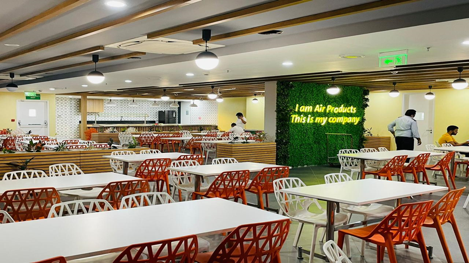
Designing a Space People Want to Use
A workplace cafeteria is often one of the busiest informal spaces in an office. Employees eat, meet colleagues, take breaks and sometimes continue conversations from formal meetings. Because the space has such a social role, branding it only as a food-service area misses an opportunity. Our approach was to treat the cafeteria as an important part of the overall workplace experience.
The first stage was understanding how people move through the space. We looked at the entrance, serving counter, seating areas, walls, windows, doors and circulation routes. This helped identify surfaces where graphics could be seen naturally without interfering with everyday operations.
Large feature walls became the main visual anchors. Instead of covering every available surface, selected areas were given stronger treatments. This created focal points while keeping the cafeteria comfortable and uncluttered.
The visual direction combined the company’s identity with themes associated with food, energy, community and interaction. Brand colours provided consistency, while illustrations, patterns and short messages made the environment feel more relaxed than formal office areas.
We also considered the viewing distance. People sitting at tables should be able to appreciate the larger visual composition, while people standing near the counter should be able to read smaller messages. This helped us create different scales of communication within the same room.
2. Balancing Branding, Materials and Function
Material selection was important because cafeterias experience regular cleaning, movement and contact. Depending on the wall surface, durable printed vinyl, laminated graphics, acrylic elements, dimensional lettering or wall coverings can be used. The material needs to look attractive while remaining suitable for the conditions of the space.
Menu areas and service zones were also treated as opportunities for branding. Food categories can be colour coded, simple icons can improve navigation and short messages can add personality. This approach allows functional information to become part of the overall design instead of appearing as a separate collection of notices.
Lighting can significantly change how graphics are perceived. A wall may appear different under warm or cool illumination, so feature areas should be reviewed in the actual lighting environment. Dimensional elements can also create shadows and depth that are not visible in a flat design.
One of our main objectives was balance. The cafeteria needed to feel connected to the company’s brand without simply copying the reception area. Employees should recognise the organisation while still experiencing the space as informal and welcoming.
A successful cafeteria branding project is ultimately about people. The strongest result comes when architecture, graphics, materials, lighting and everyday movement are considered together. The finished environment can then become more than a dining room: it becomes a visual expression of workplace culture and a space employees naturally associate with interaction, comfort and community.


