Understanding the Visual Character of Each Material
Signage material influences far more than appearance. It affects how a brand is perceived, where the sign can be installed, how it can be illuminated and how it will perform over time. Acrylic, metal and ACP are three widely used choices, but each creates a different visual and practical result.
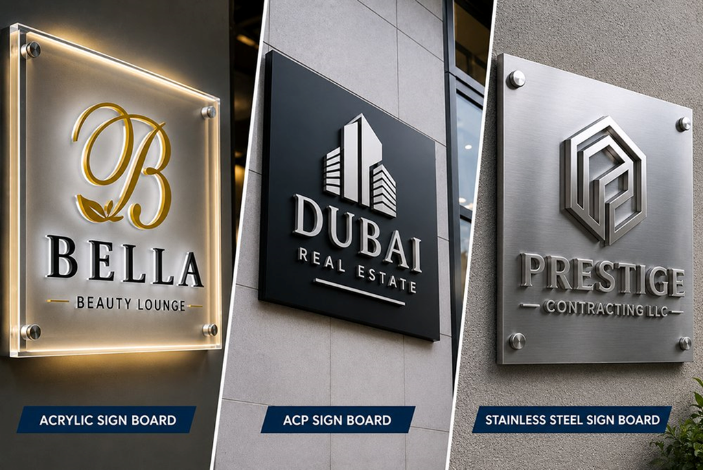
Acrylic is frequently selected for reception logos, dimensional letters, room signs and illuminated branding. Its clean surface and sharp edges give it a contemporary appearance. Acrylic can be produced in different colours, cut into detailed shapes and layered to create depth. It can also be paired with lighting for front-lit or halo-lit effects.
Metal signage creates a more architectural character. Stainless steel, aluminium, brass and other finishes can provide a premium appearance. Brushed surfaces can look understated, while polished finishes can attract attention. Metal letters are often suitable for reception walls, corporate entrances and premium environments where the material itself is part of the design.
ACP, or aluminium composite panel, is commonly used for larger signage surfaces and backing panels. It is lightweight, rigid and available in a variety of finishes. ACP can work well for building fascias, exterior signboards and large wall systems, and it can be combined with raised acrylic or metal letters.
The important point is that there is no single material that suits every brand. The decision should be connected to location, size, viewing distance, lighting, design language and expected lifespan.
2. Choosing the Right Combination for the Location
For a modern indoor reception, acrylic can create a clean and polished identity. Layered acrylic letters or illuminated logos can provide dimension without making the wall feel heavy. If the brand positioning is more premium or architectural, metal can add texture and substance.
For larger exterior surfaces, ACP can provide a practical foundation. Raised acrylic or metal lettering can then be added on top to create depth. This combination can deliver both structural practicality and a stronger branded appearance.
Durability should always be evaluated according to the environment. Outdoor signs must deal with sunlight, rain, dust and temperature changes, while indoor signs face different risks such as cleaning, accidental contact and surface wear. Fixing methods and wall conditions are equally important.
Budget should be considered across the life of the sign rather than only at the time of purchase. A more durable or premium solution may be worthwhile for a high-visibility reception or building entrance that will remain in place for many years. Temporary campaigns, on the other hand, may call for lighter and easier-to-change options.
The best signage projects sometimes combine all three materials. An ACP panel can create the background, acrylic can introduce brand colours and metal details can provide a premium accent. Before finalising the specification, businesses should review physical samples and consider the actual lighting and installation conditions. When material, design, location and brand identity work together, the result is signage that looks intentional, performs reliably and represents the business professionally.