

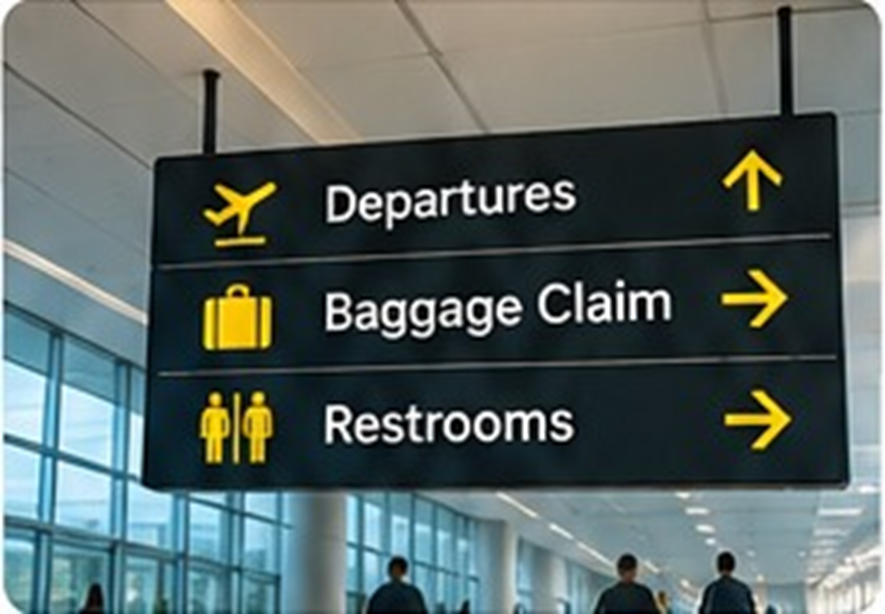
A simple lesson from a complex environment
Airports manage a constant flow of people who may be unfamiliar with the building, in a hurry and carrying different priorities. Passengers need to find check-in, security, gates, baggage collection, lounges and exits. Good airport wayfinding helps them make decisions quickly without needing to ask for directions at every turn. Corporate offices face a smaller version of the same challenge. Employees, clients, delivery partners and interview candidates all need to move through the workplace with confidence.
Consistency is more useful than more signs
When signs use different colours, fonts, symbols and naming systems, people have to stop and interpret them. Airports demonstrate the value of a consistent visual language. A corporate office can use the same principle by choosing a clear typeface, a limited colour palette and familiar icons. Use the same names for destinations everywhere. If a room is called ‘Orchid’ on the booking system, avoid labelling it ‘Conference Room 2’ on the corridor sign. Consistency reduces hesitation.
Put information where decisions happen
A sign is useful only when it appears at the point where someone needs to make a choice. Place directional information before a junction, not after it. Identify lifts, staircases, washrooms and meeting zones at natural decision points. At the entrance, show the main destinations. On each floor, provide a simple directory. Near meeting rooms, make room names and numbers visible from a comfortable distance. This layered approach gives people enough information for the next step without overwhelming them.
Use colour and symbols with purpose
Colour coding can help distinguish departments or zones, especially in larger offices. For example, one colour may identify meeting spaces while another marks shared facilities. Icons can support quick recognition for washrooms, lifts, cafeterias and accessible routes. However, colour should never be the only way information is communicated. Pair it with words and clear symbols so that the system remains useful to people with different visual needs. Keep contrast strong and text large enough to read.
Design for every kind of visitor
An effective wayfinding system considers people who visit once as well as employees who know the building. It should also account for accessibility, language clarity and different mobility needs. Avoid unnecessary jargon, make routes step-free where possible and ensure signs are not hidden behind doors or furniture. Test the system with someone who has never visited the office. Watch where they pause, turn the wrong way or ask for help. Those moments reveal where the design needs improvement.
Navigation is part of the brand experience
A workplace that is easy to navigate feels organised and considerate. It saves time, reduces interruptions and allows meetings to begin on schedule. More importantly, it shows that the organisation has thought about the experience of everyone entering its space. Like airports, offices work best when people can focus on their destination instead of worrying about how to get there.
Test the route, not just the artwork
Before ordering a complete signage package, create a simple floor plan and trace a few common journeys: entrance to reception, reception to a meeting room, meeting room to washroom and office to exit. Check whether a visitor can complete each route using the proposed signs alone. Temporary paper signs can help test wording and placement. Ask a colleague unfamiliar with the floor to try the route. Their feedback can reveal missing decision points, confusing room names or signs that are too small.
