

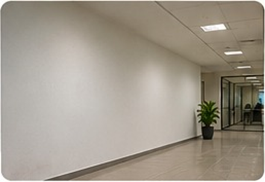
Empty does not always mean unfinished
Large blank walls can make an office feel cold, temporary or disconnected. They can also be an opportunity. Walls are among the most visible surfaces in a workplace, yet they are often treated as an afterthought. With a little planning, they can communicate what the organisation does, help employees feel connected to its purpose and make the environment more engaging for visitors. The best solution is not to cover every available surface. It is to decide what each important wall should contribute.
Give every wall a job
Begin by identifying the role of the space. A reception wall may introduce the brand. A corridor could tell the story of the organisation’s journey. A collaborative area might display values, milestones or team achievements. A meeting room could use subtle graphics that support its theme without distracting from conversation. In a customer-facing area, a wall may explain a product or service in a simple visual way. When the purpose is clear, the design becomes more focused and less likely to look decorative for decoration’s sake.
Choose a format that suits the space
Wall graphics are versatile and can be tailored to different surfaces and budgets. Large-format imagery can create a strong visual focal point. Typography-led graphics can make a short message memorable. A timeline can present company milestones, while a map or process illustration can explain complex work. Framed displays, dimensional lettering and carefully selected artwork can add depth. Consider the wall’s size, viewing distance, lighting and surrounding furniture before selecting a format.
Keep the message clear and authentic
A wall should say something meaningful about the organisation. Avoid filling it with generic motivational phrases that could belong to any office. Instead, use language drawn from the company’s real values, work and culture. If the organisation is built around innovation, show what innovation looks like in practice. If customer service is central, highlight the people and actions behind that promise. Use concise copy, strong hierarchy and enough open space for the design to breathe.
Think about durability and maintenance
Before installation, assess the wall surface and the conditions around it. High-traffic corridors may need durable, easy-to-clean materials. Areas with direct sunlight require attention to colour stability. Check that the wall is smooth, dry and suitable for the selected finish. Plan the layout around switches, doors, glass panels and furniture. A professional site measurement and proofing process can prevent alignment issues and help the finished graphic look polished.
Create a workplace people recognise
The strongest office walls do more than fill space. They make the workplace feel distinctive and help people understand what the organisation stands for. Start with one high-impact area, review how people respond and build a consistent visual language across the office. A thoughtful wall design can turn an overlooked surface into a useful brand touchpoint.
Build a simple wall plan
A useful way to begin is to photograph the office and mark the walls that have the strongest visibility or the clearest purpose. Rank them by impact rather than size. One prominent reception wall may matter more than several small surfaces in a back corridor. Set a simple brief for each selected wall: audience, message, visual format and desired response. This makes it easier to compare design options and keeps the project aligned with business goals. It also prevents the common mistake of approving attractive artwork that has no connection to the organisation.
