

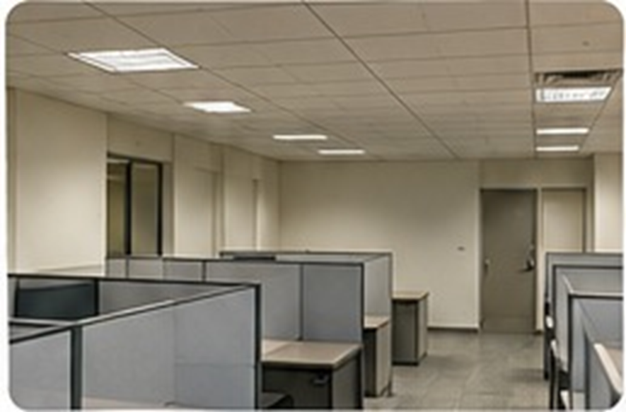
A modern look does not always require a rebuild
An office can begin to feel dated because of faded colours, old signage, worn graphics or inconsistent furniture rather than a problem with the building itself. A full renovation may be expensive, disruptive and unnecessary. In many cases, a carefully planned visual refresh can make the workplace feel more current while allowing teams to continue using the existing layout. The key is to identify what looks tired and prioritise changes that make a visible difference.
Start with a practical visual audit
Walk through the office and note the areas people see most often: the entrance, reception, corridors, meeting rooms, pantry and collaborative zones. Look for peeling graphics, damaged signs, discoloured walls, outdated brand colours and poor lighting. Take photographs from the perspective of an employee and a visitor. This makes it easier to distinguish between issues that need repair and areas that would benefit from a design update. Avoid trying to change everything at once.
Use wall graphics to create a fresh identity
A new wall graphic can transform a familiar room without changing its structure. Consider a clean feature wall in reception, a brand-colour treatment in a meeting area or a simple graphic that communicates the company’s purpose. Updated typography, dimensional lettering and carefully selected imagery can replace dated visual elements. Keep the design connected to the brand so that the office feels refreshed rather than decorated with unrelated trends.
Improve the atmosphere with smaller changes
Lighting has a major effect on how a space feels. Replace tired or inconsistent light fittings where practical, and make sure key areas are bright enough for their purpose. Add a consistent signage system, tidy visible cables and remove unnecessary posters. Refresh door labels and room numbers. Reorganise display areas and use a limited palette of finishes. If furniture is still functional, rearranging it or updating selected pieces may be more effective than replacing everything.
Make the update cohesive
Modern spaces often feel modern because their elements work together. Choose a small set of colours, materials and graphic styles, then apply them consistently. Check that new wall graphics complement existing flooring, furniture and lighting. Use clear signage with readable type. Avoid overcrowding walls with too many messages. A few well-designed focal points usually create a stronger result than many competing features.
Plan the work to minimise disruption
Group updates by zone and schedule installation around office hours or quieter periods. Confirm measurements, artwork, material samples and surface preparation before work begins. Decide who will approve the final designs and who will coordinate access. A phased approach lets the organisation spread costs and learn from each stage. It also helps avoid unnecessary downtime.
Refresh what people experience every day
An office does not need to be brand new to feel contemporary. It needs to feel cared for, coherent and suited to the people who use it. By updating graphics, signage, lighting and key visual details, businesses can create a more confident workplace without committing to a full renovation.
Prioritise by impact and cost
Not every improvement needs to happen in the same phase. A business can begin with the entrance, reception signage and the most visible feature wall, then move to meeting rooms and corridors. Prepare a list of quick fixes, such as replacing faded labels, removing outdated notices and improving cluttered displays. Separate these from planned upgrades that need design, printing or installation. A phased plan makes spending easier to control and gives the team a clear way to measure progress.
